We worked closely with PCA’s product, marketing, sales, and customer support teams to gather insights. Our user experience design team focused on three primary challenges.
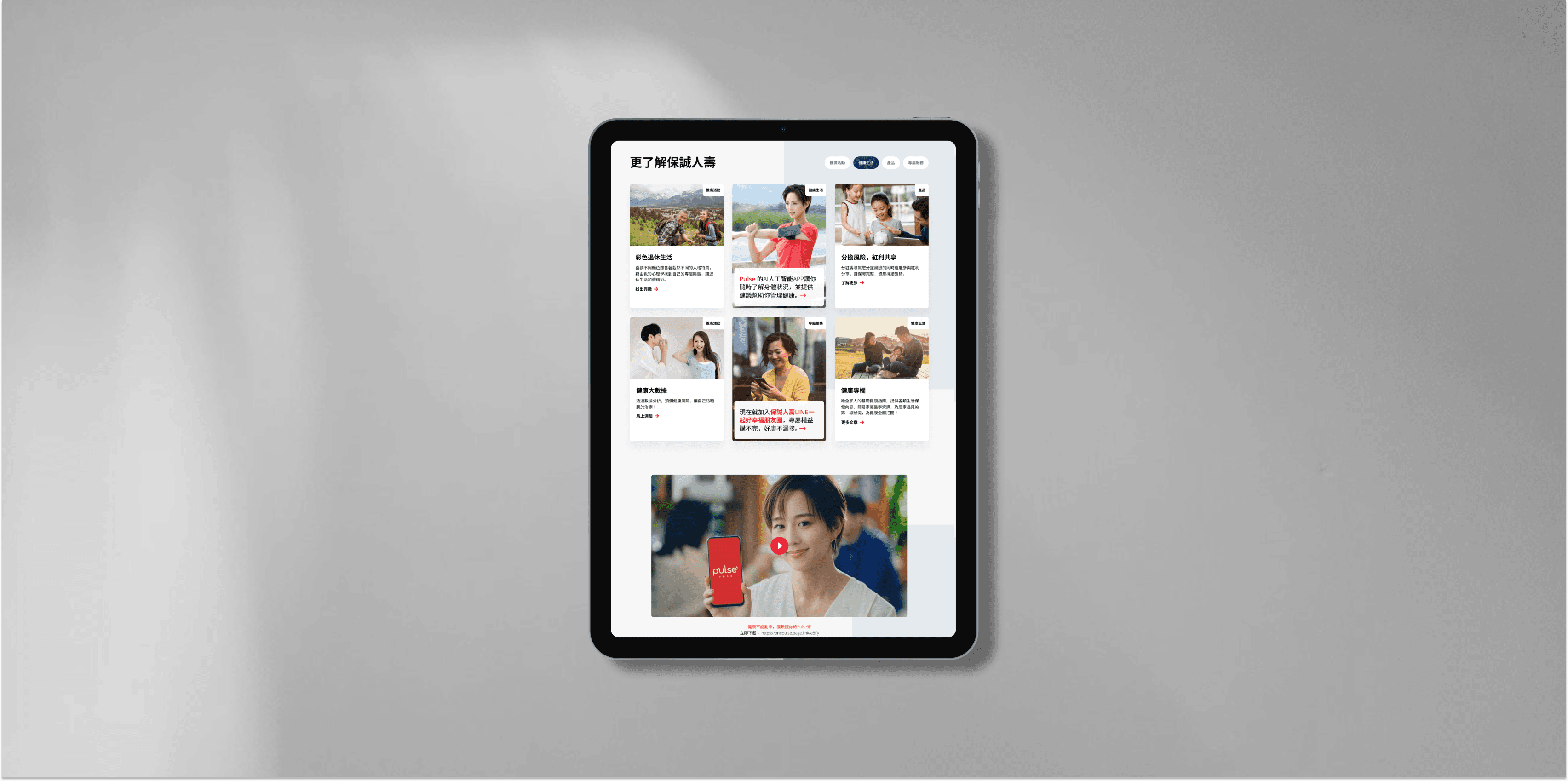
We discovered that users in Taiwan want easier navigation, clear sections for key benefits and payment options, improved search, better display of product details, and higher-quality images for a stronger brand impression.
Focus more on "Claims and Services" and prioritize accessibility for elderly users, setting us apart from regional.
PCA website differentiates itself with simple navigation and personalized content, but it lags in search functionality and brand visual appeal compared to competitors in Taiwan.
Complex Navigation
Content Overload
Inconsistence Branding & Searching Function
Applying the regional design system, our goal is to simplify the user journey by adjusting navigation, highlighting key product benefits, and enhancing brand visual language. This approach aims to create a intuitive and accessible experience for users in Taiwan.
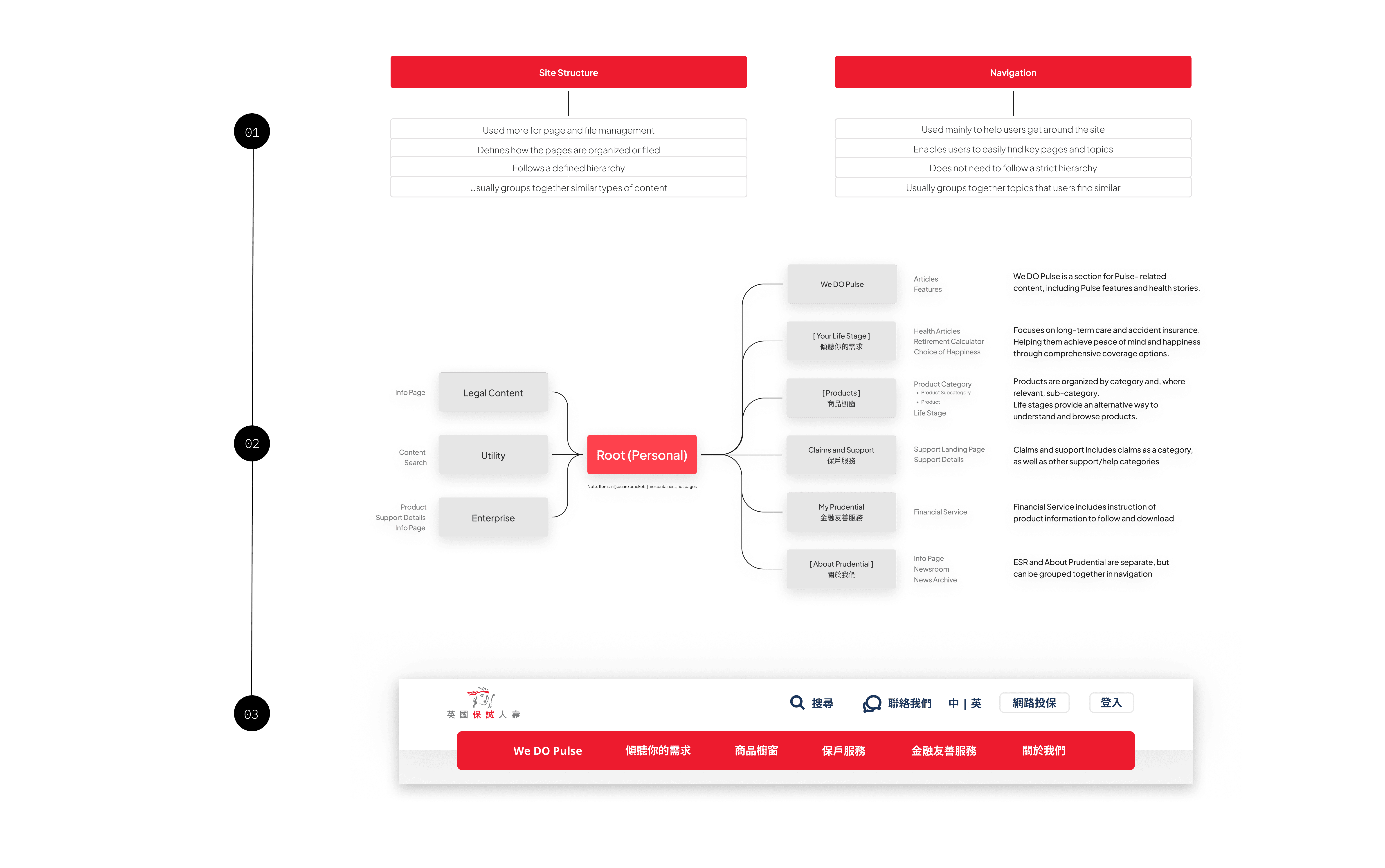
Information Architecture
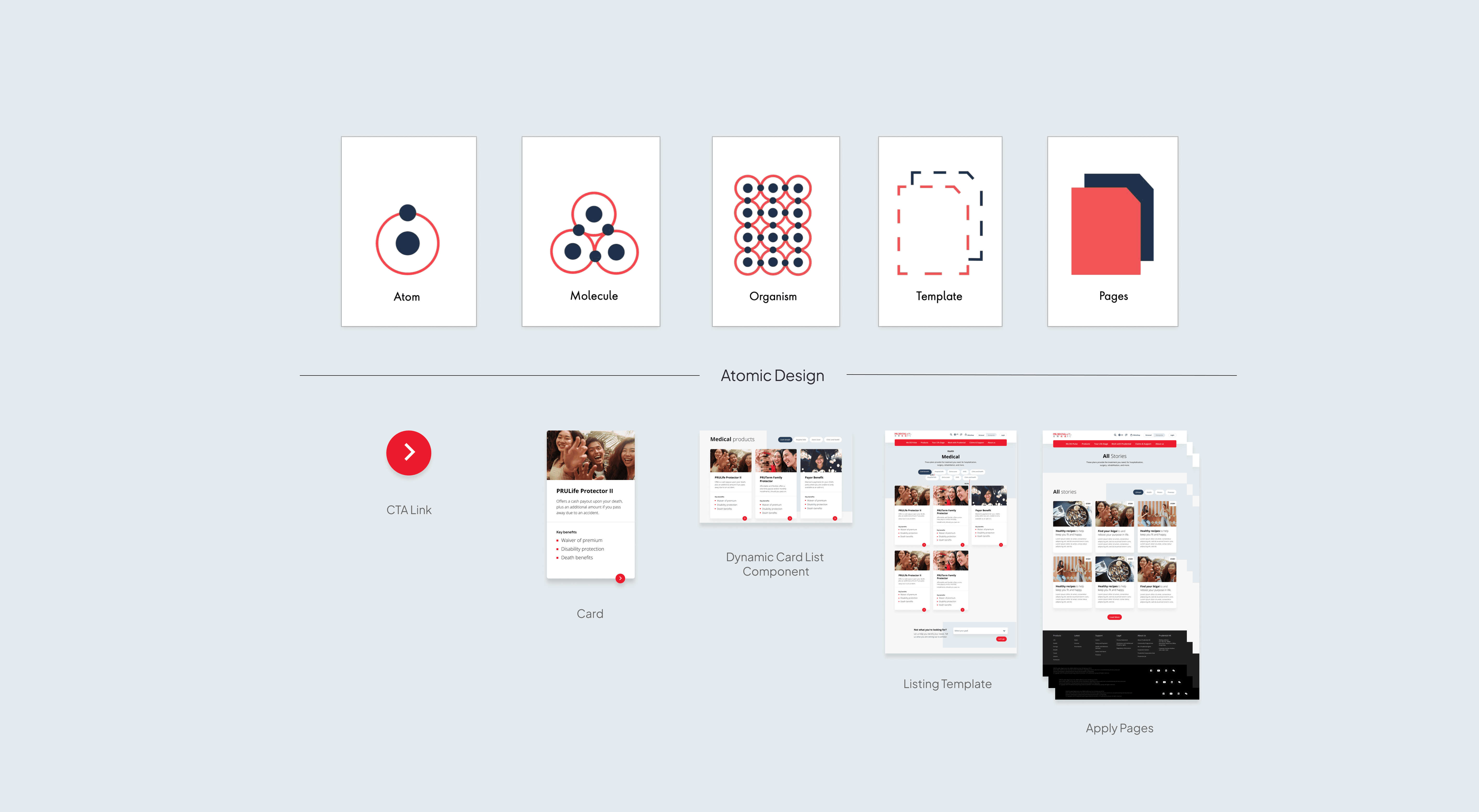
Atomic Design
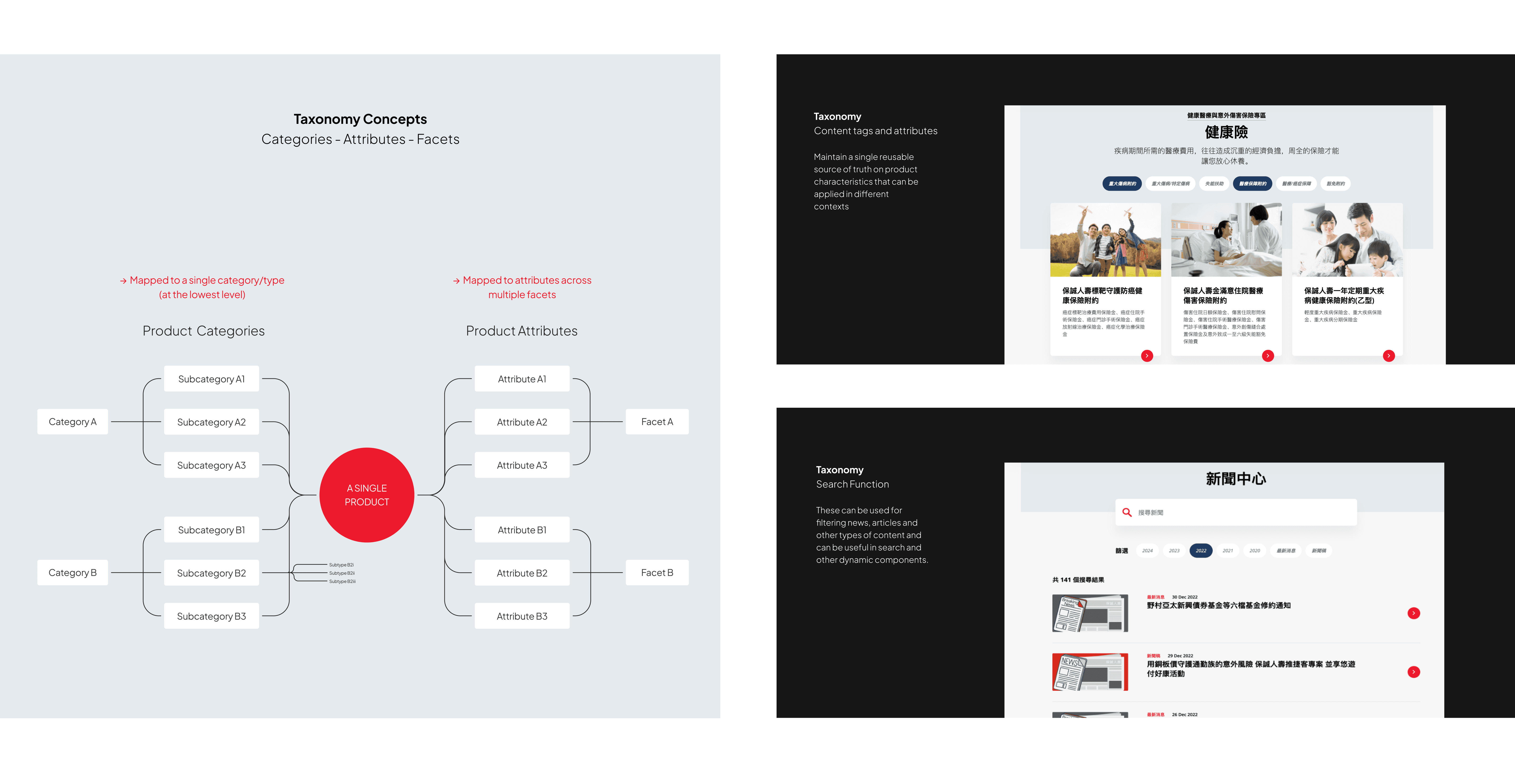
Product Taxonomy
Using the site structure and navigation to analyze the main product and content inventory.
Challenges and Breakthroughs
While organizing the content inventory, we found many low-traffic, low-value pages. Removed these and consolidated the information for better quality.
For this website, the design team was responsible for translating the atomic design model into the overall user experience of an exercise to clearly display all the product information and make the visual language consistence.
Challenges and Breakthroughs -1
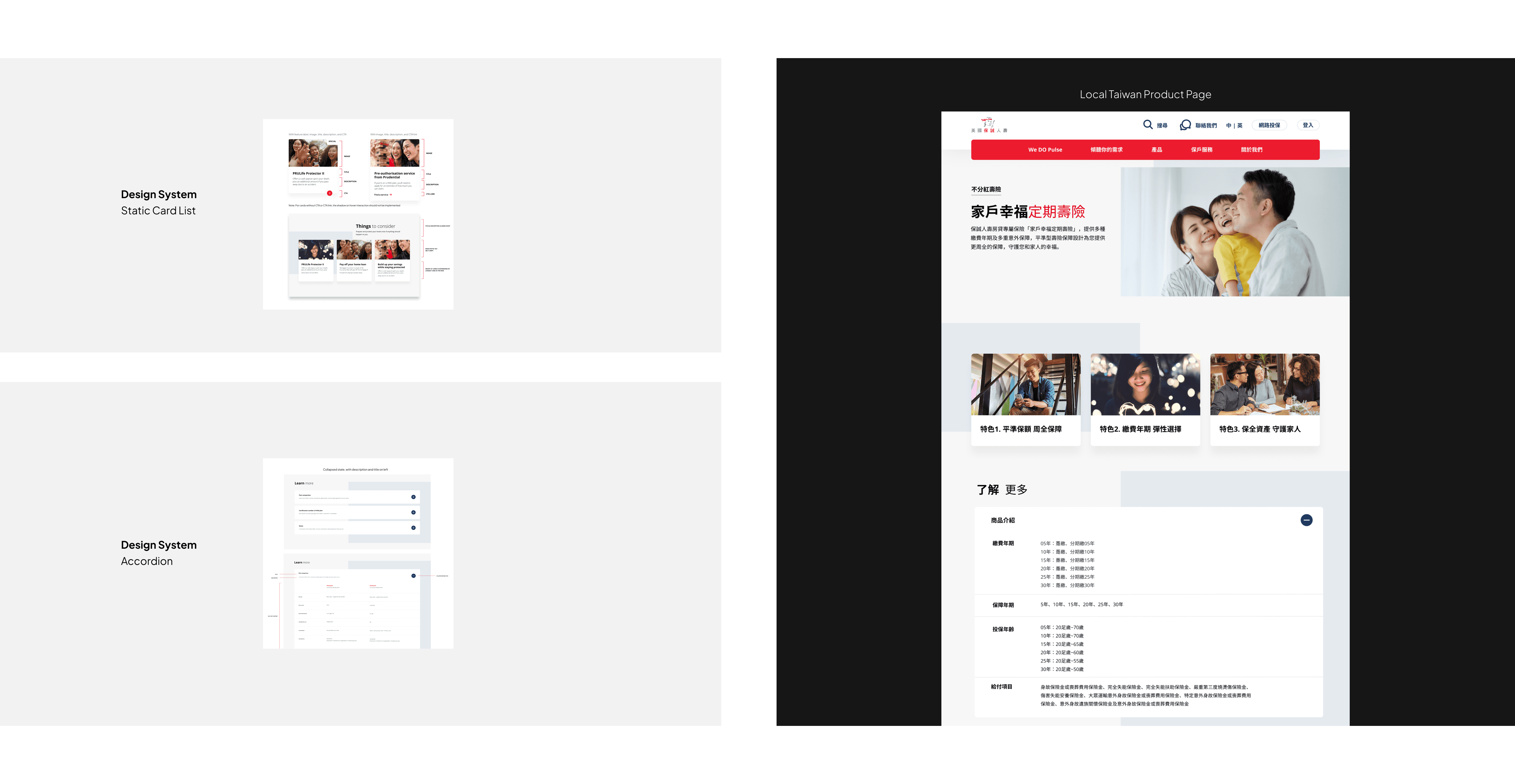
Our local product site had lengthy descriptions, so we applied a "static card list" to highlight key features and an "accordion" at the bottom to break down complex content into smaller sections for easier navigation.
Challenges and Breakthroughs -2
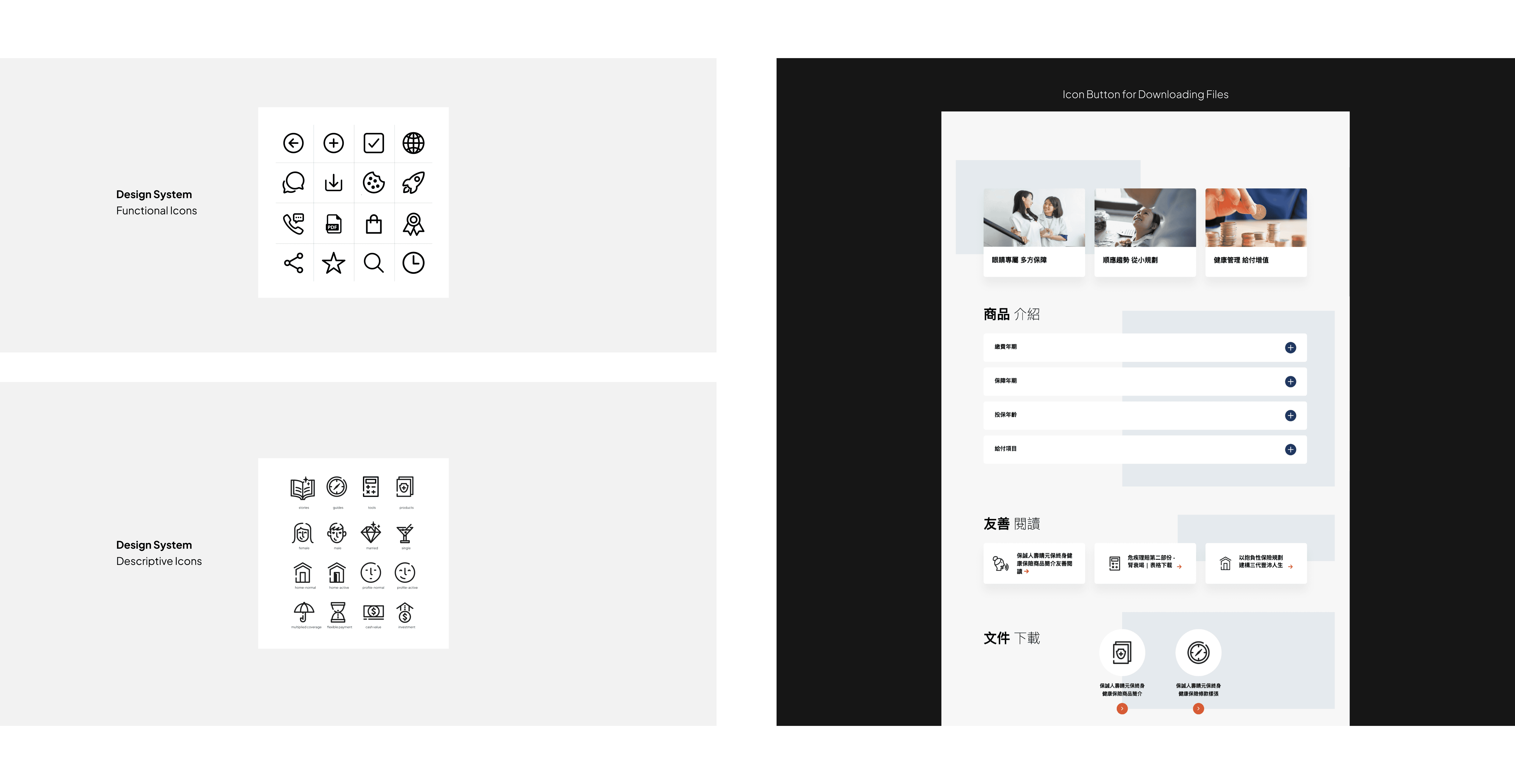
Through user testing, we found that many of our users were seniors, so we ensured that the icons were easy for them to understand at a glance.
Organized confusing product details using a taxonomy structure, bridging the gap between consumers and the business.
Challenges and Breakthroughs -1
Inconsistent product displays made searching difficult. We organized and classified content units, defining relationships and properties to improve search functionality and make it more localization.
We restructured the information architecture, making it intuitive and easy to navigate. By simplifying complex information using site structure and navigation.
By incorporating culturally relevant content and design elements, we enhanced the platform’s relevance to Taiwanese users. This localized approach led to a deeper connection with the brand and a measurable increase in user retention.
Apply atomic design system that emphasized accessibility and consistency. Not only tailored for the Taiwanese market but was also flexible to be adapted for other regions.
The design system we applied has become an important prudential’s digital strategy in Asia, providing a scalable framework that can be implemented across multiple markets.
Over 300+ users give positive feedback after post-launch, with users appreciating the intuitive navigation and clear, accessible information. This reinforced Prudential’s reputation as a trusted, customer-focused brand in the competitive insurance market.